Friday 30 November 2012

Changes to my font


On the left you can see how I initially was going to have my contents page, sticking with a colour scheme of black and white. After feedback I found it was too plain which is why I decided to change the contents page title as well as the title of the different pages to a red colour as the red, white and black went better with the type of magazine i'm creating and would be more interesting to the black and white I was going to use. I also used the text effects to create a red stroke around the word contents page to go with the rest of the red in the page. To finish off the column showing the different pages, I used the line tool on the page between each of them to keep them separate.

Wednesday 28 November 2012

Progress so far

So far this is my contents page, for the font of 'Contents Page' I have gone for a font that fits the genre of my magazine, rock. The layout I have chosen to use is having pictures to the left that relates to what is on the pages in my magazine. I have kept to a simple font for the rest of my contents page to keep it quite simple by still giving the reader the information they need. After having feedback I have decided to go with the black background and white writing as I feel it is less plain and the white stands out more from the black creating a nice contrast that is used a lot in rock magazines.

Tuesday 27 November 2012

Which do you prefer?


This is a rough contents page of the kind of layout I want my contents page to have, but I need your opinion, do you prefer the first one of the white background with black writing or the second one of the black background with the white writing?

Thursday 22 November 2012

Finished Front Cover


From the feedback I have received on my front cover I have made a few changes; I have added a white glow around the title of the magazine to help it stand out but to not be too obvious, as before it had a bright Red glow around it and although it went with the colourscheme of the magazine it didn't look right to me and I asked a few other people what they thought who also said they preferred it without the red glow. I have also used a different font for the name 'Jack Arnold' so that it automatically stands out to the reader and will attract fans of his music to the magazine, to the words 'Exclusive interview with Jack Arnold' I have also used the stroke tool to make a black outline around the magazine to show its the main feature and most important that people see it. I have also used the font effects to use the 'emboss' tool on the words in black to make those words look more interesting as otherwise all the other titles would just be in the same font. 

Tuesday 20 November 2012

Opinions!?


So this is my magazine background at the moment, leave your opinions of what you think of it
Thanks :)

Friday 16 November 2012

Front cover so far


This is currently the stage I am at with my front cover. I like the way the fonts fit in with the kind of genre my magazine is, the next step for my front cover is to take a suitable photo for the background. At the moment I feel the background is too plain especially when I look at other magazine examples in the same genre of music.

Tuesday 13 November 2012

Front Cover Photoshop Printscreens


 This picture is the original photo, before I edited it on photo shop.


This second picture shows the difference in the skin before and after editing, to improve the skin I used the spot healing brush tool

This picture shows how I used the magic wand tool to select the pupils of his eyes and went to image, adjustments and changed the colour balance.

This picture is showing the process of how I used the magic wand tool to select the bits of his face I wanted to change which I then used the colour balance to change the colour of his face as his skin tone came up pink toned on the photo compared to his neck.

This picture shows the difference before I changed the skin tone and after, as you can see, its a subtle difference but makes the skin look less pink toned. The change in his skin tone makes his skin look flawless like other magazine covers.

This picture shows the original picture I took on the left, to the edited picture on the right. After this print screen was taken I also rotated the image horizontally so that the title of the magazine could go on the left hand side like all other magazine titles.


Thoughts?


This is my front cover so far, but i need your opinion on whether I should do this front cover in black and white or not?

Comment with your thoughts please :)

Photo shoot Contact sheet


Monday 12 November 2012

Font!?


Plan for: double page spread photo shoot


Plan For Double Page Spread Photo Shoot

Location
For the location on this photo shoot I will be taking pictures of the artist outside. This is because the article is all about getting to know the 'celebrity' and the natural environment of the pictures will reflect how the article shows their natural personality.

Props
I wont be using any props for this photo shoot as I want to keep it simple.

Person
The person I will be using for the double page spread is Jack Arnold, I feel showing a different side of him even from the front cover will be interesting for the readers to see and will interest them more.

Clothing
The clothing my 'celebrity' will be wearing for this photo shoot will be more relaxed, in contrast to the black skinny jeans on the front cover, he will be wearing looser fitting jeans. He will also be wearing converse with a checkered shirt to show even when he is away from being his musician self he is still edgy with what he wears.

Lighting

As this is photo shoot is going to be taken outside I will be using the natural lighting outside, hopefully on a day where the sun is out as it will help to reflect the 'celebrities' mood.

Plan for: contents page photo shoot


Plan For Contents Page Photo Shoot

Location
The location of this photo shoot will be in a variety of places, this is because I will be making a collage of different images to reflect one of the other articles in the magazine.

Props
For this photo shoot I wont be using any props as I don't think the pictures will need it.

Person
I will be using a variety of people, these people will help to reflect the music used in the magazine and will give an impression of the sort of people who will enjoy the magazine.

Clothing
The clothing I will be asking the people to wear is plainer clothes, darker clothes as it will go with the colour scheme of the magazine and contrast with the white used on the page.

Lighting
There will be different lighting used depending on where each photo is being taken; for the inside photos I will be using artificial light, for the outdoor I will be using natural lighting.

Plan for: front cover photo shoot


Plan For My Front Cover Photo shoot

Location
The location for my photo shoot to get the front cover photo will be shot with my chosen 'celebrity' looking out from a stage, inside. The camera angle will be shot lower, looking up which will help to reflect how the fans feel about this artist, as if he is God. This location will help to portray his character as being a born entertainer and will give readers the right image about him.

Props
The possible props I may use for my photo shoot is; a microphone or some sort of musical instrument. I feel either of these props will help to show how the 'celebrity' loves what he does and is keen to play music even in his spare time.

Person
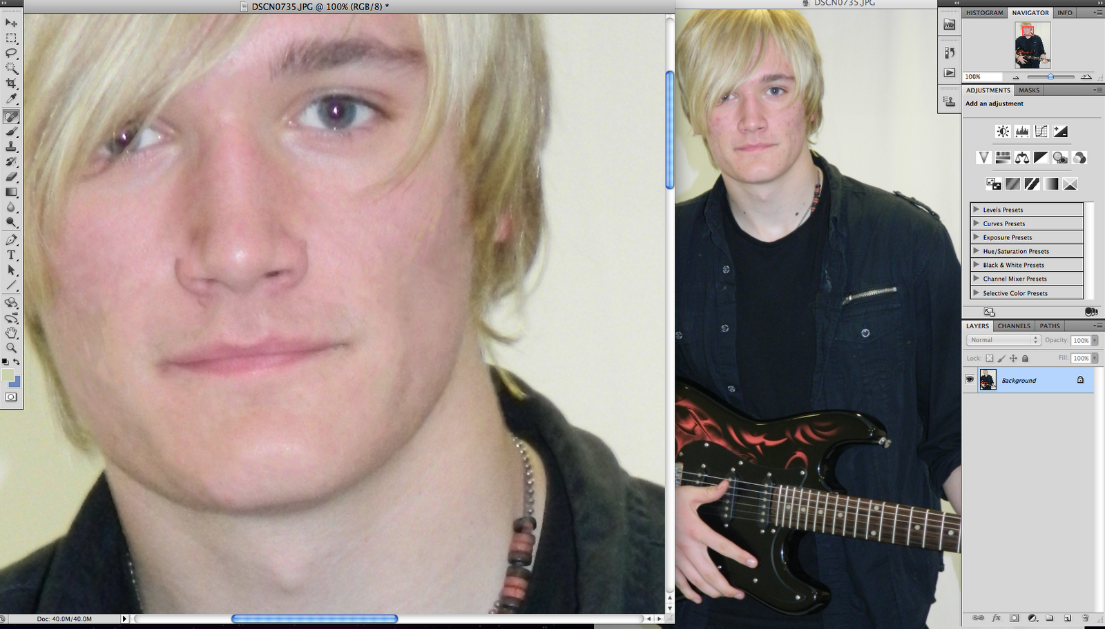
The person I will be using is Jack Arnold, this is because the way he looks reflects the sort of music that I will be advertising and writing about in my music magazine.

Clothing
The clothing my 'celebrity' will be wearing is a black sleeved shirt, t-shirt, black jeans and black converse, wearing bracelets on his arms. I feel this look will be reflecting the music in the magazine and before the reader opens the magazine they will have an idea of what the magazine is about.

Lighting
Depending on the weather outside, I will probably be using the artificial lighting that is in the hall. This will make the pictures brighter and create more of a contrast from the darkness of the clothes to the lightness of the walls.

Draft 2 for front cover, contents page and double page spread