Friday 30 November 2012

Changes to my font


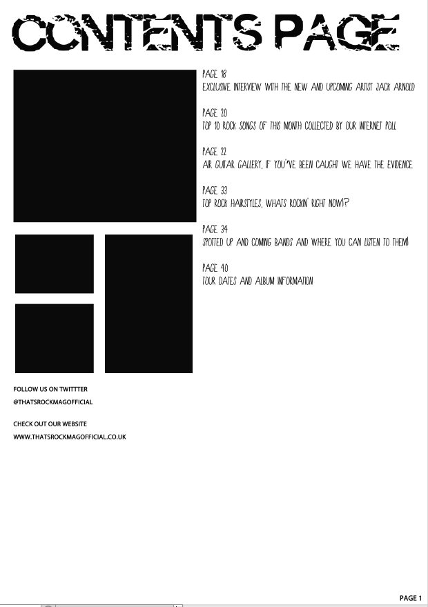
On the left you can see how I initially was going to have my contents page, sticking with a colour scheme of black and white. After feedback I found it was too plain which is why I decided to change the contents page title as well as the title of the different pages to a red colour as the red, white and black went better with the type of magazine i'm creating and would be more interesting to the black and white I was going to use. I also used the text effects to create a red stroke around the word contents page to go with the rest of the red in the page. To finish off the column showing the different pages, I used the line tool on the page between each of them to keep them separate.

Wednesday 28 November 2012

Progress so far

So far this is my contents page, for the font of 'Contents Page' I have gone for a font that fits the genre of my magazine, rock. The layout I have chosen to use is having pictures to the left that relates to what is on the pages in my magazine. I have kept to a simple font for the rest of my contents page to keep it quite simple by still giving the reader the information they need. After having feedback I have decided to go with the black background and white writing as I feel it is less plain and the white stands out more from the black creating a nice contrast that is used a lot in rock magazines.

Tuesday 27 November 2012

Which do you prefer?


This is a rough contents page of the kind of layout I want my contents page to have, but I need your opinion, do you prefer the first one of the white background with black writing or the second one of the black background with the white writing?

Thursday 22 November 2012

Finished Front Cover


From the feedback I have received on my front cover I have made a few changes; I have added a white glow around the title of the magazine to help it stand out but to not be too obvious, as before it had a bright Red glow around it and although it went with the colourscheme of the magazine it didn't look right to me and I asked a few other people what they thought who also said they preferred it without the red glow. I have also used a different font for the name 'Jack Arnold' so that it automatically stands out to the reader and will attract fans of his music to the magazine, to the words 'Exclusive interview with Jack Arnold' I have also used the stroke tool to make a black outline around the magazine to show its the main feature and most important that people see it. I have also used the font effects to use the 'emboss' tool on the words in black to make those words look more interesting as otherwise all the other titles would just be in the same font. 

Tuesday 20 November 2012

Opinions!?


So this is my magazine background at the moment, leave your opinions of what you think of it
Thanks :)

Friday 16 November 2012

Front cover so far


This is currently the stage I am at with my front cover. I like the way the fonts fit in with the kind of genre my magazine is, the next step for my front cover is to take a suitable photo for the background. At the moment I feel the background is too plain especially when I look at other magazine examples in the same genre of music.

Tuesday 13 November 2012

Front Cover Photoshop Printscreens


 This picture is the original photo, before I edited it on photo shop.


This second picture shows the difference in the skin before and after editing, to improve the skin I used the spot healing brush tool

This picture shows how I used the magic wand tool to select the pupils of his eyes and went to image, adjustments and changed the colour balance.

This picture is showing the process of how I used the magic wand tool to select the bits of his face I wanted to change which I then used the colour balance to change the colour of his face as his skin tone came up pink toned on the photo compared to his neck.

This picture shows the difference before I changed the skin tone and after, as you can see, its a subtle difference but makes the skin look less pink toned. The change in his skin tone makes his skin look flawless like other magazine covers.

This picture shows the original picture I took on the left, to the edited picture on the right. After this print screen was taken I also rotated the image horizontally so that the title of the magazine could go on the left hand side like all other magazine titles.